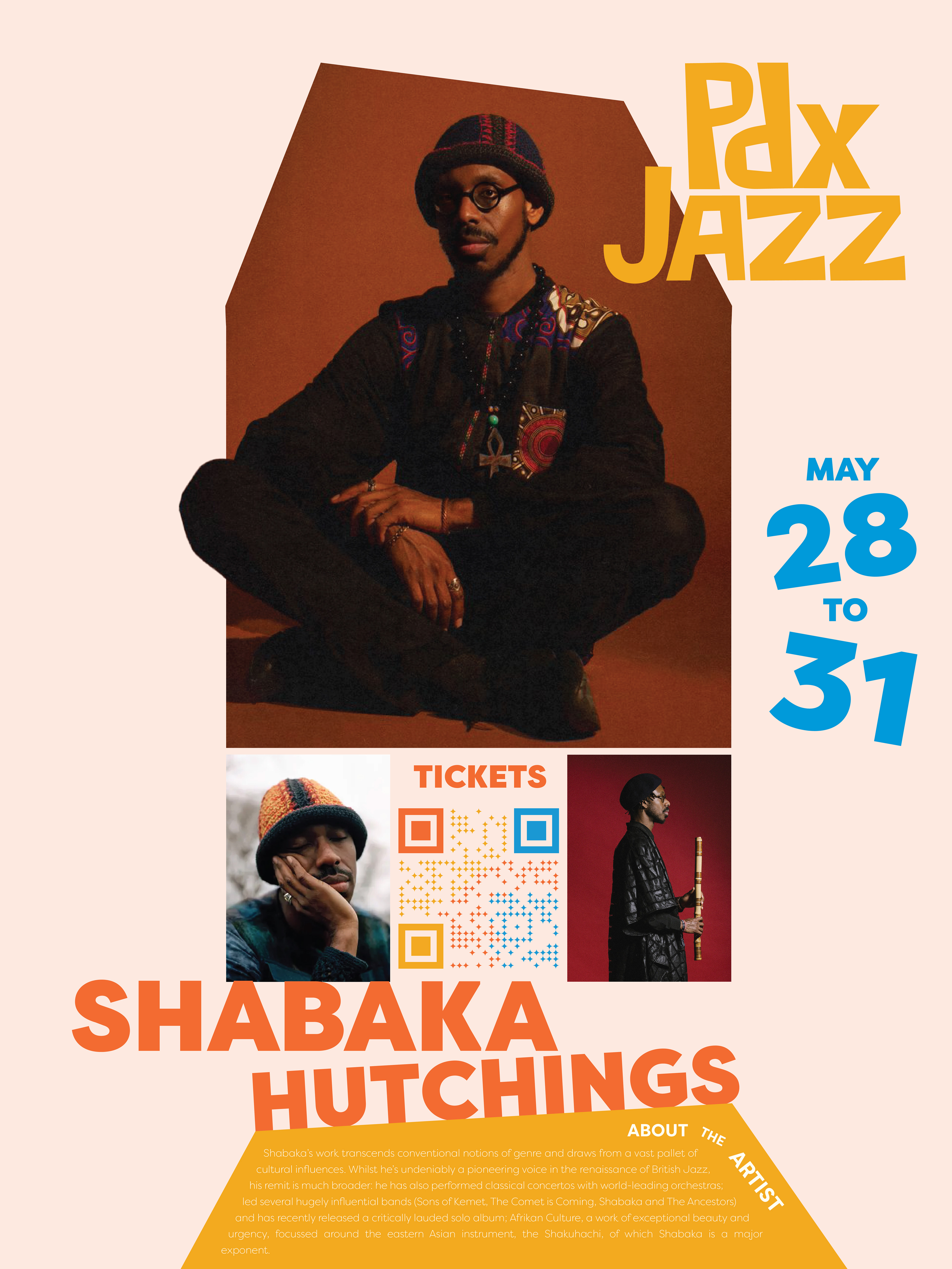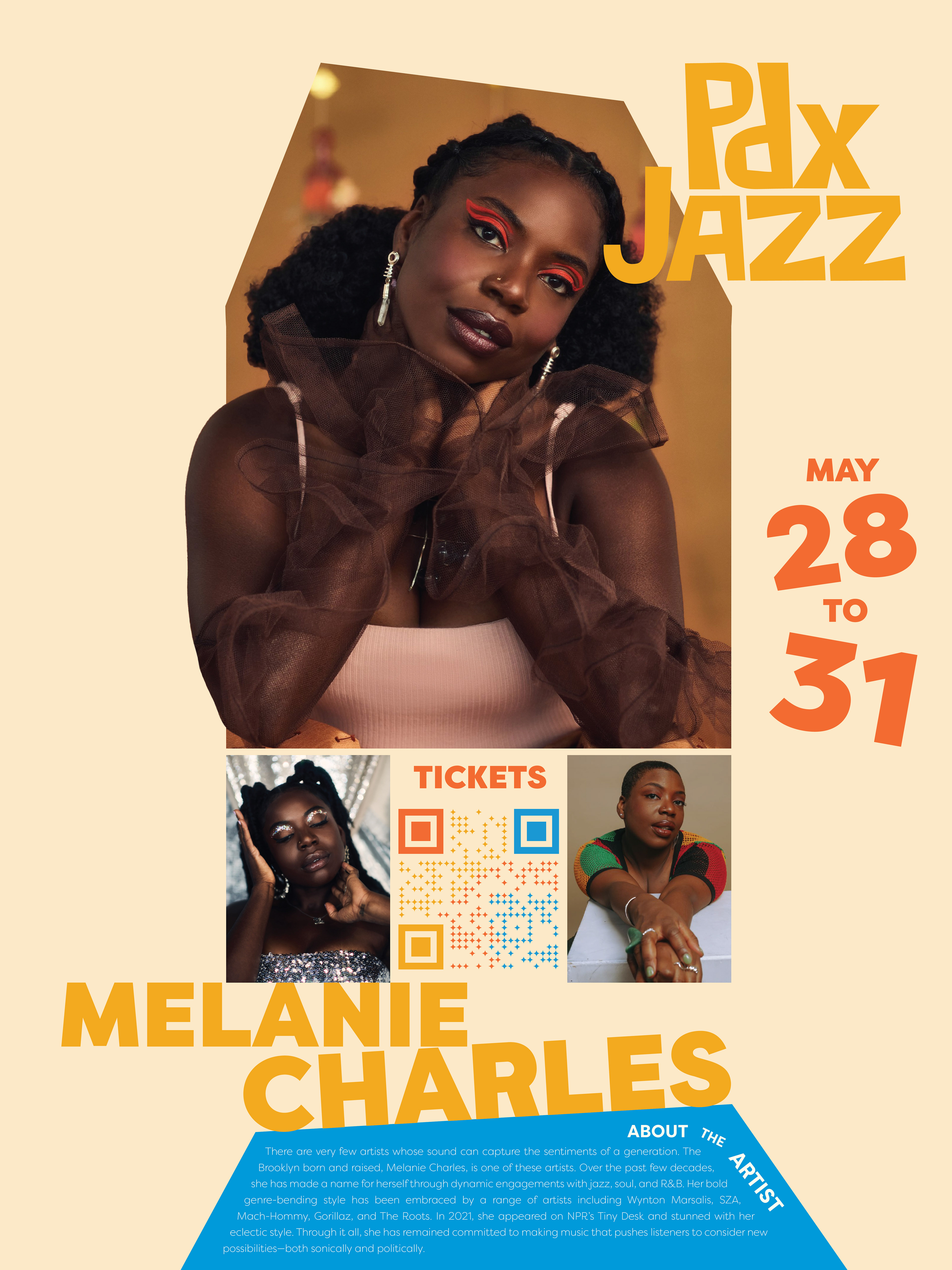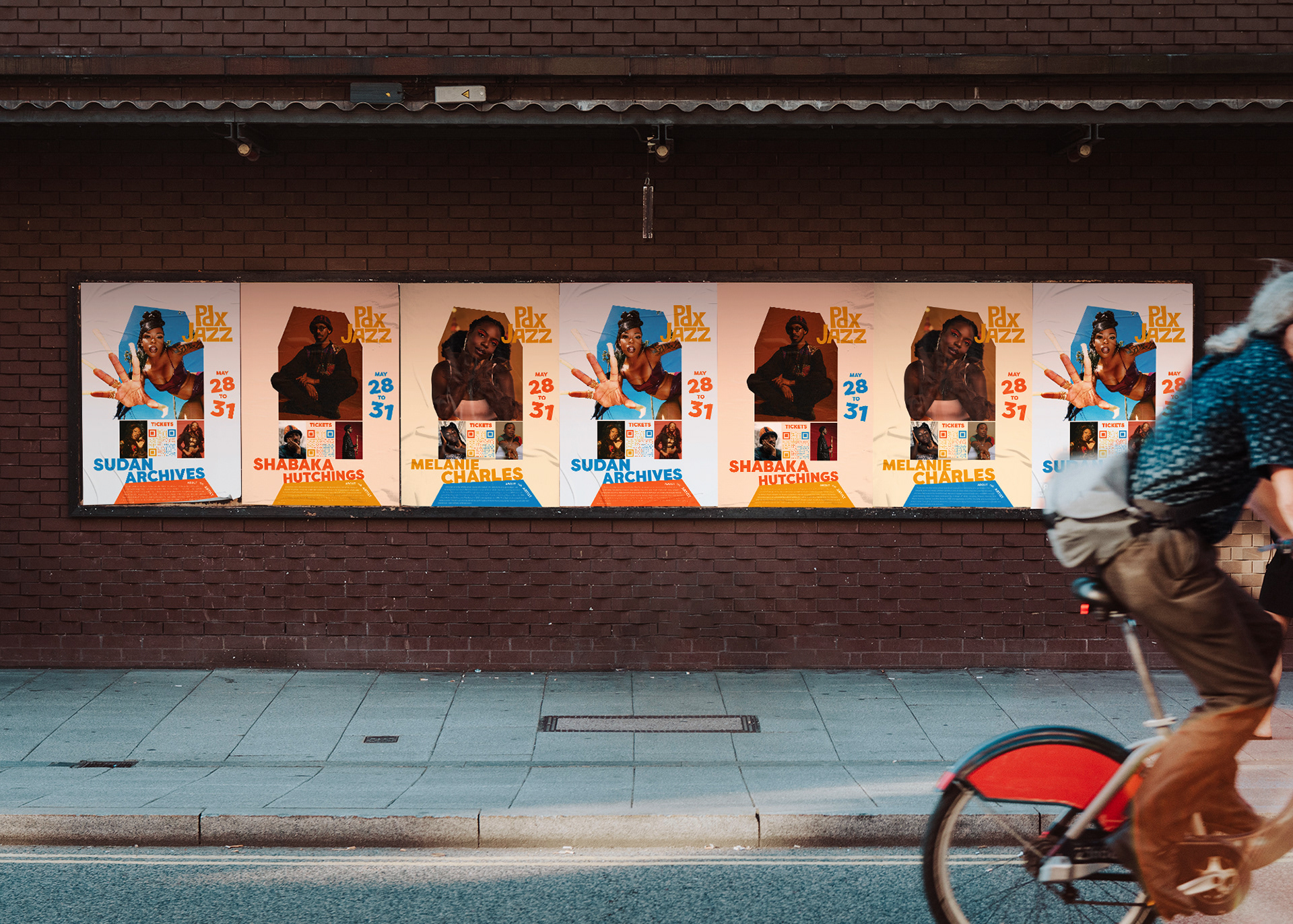


OVERVIEW
This is a concept logo and brand redesign of the Portland Jazz Festival.
THE QUESTION
How do I create a logo that better represents Jazz music & creates intrigue for younger festival goers?
THE GOAL
To take the original generic logo and turn it into something that feels improvisational and musical, like Jazz. I wanted to breathe life into the original logo using bold colors and shapes the way that Jazz breathes life into a community.
THE SOLUTION
The PDX Jazz Festival’s mission statement is:
“Our mission is to evolve the art of jazz by engaging our community, celebrating live performance, and enhancing arts education.”
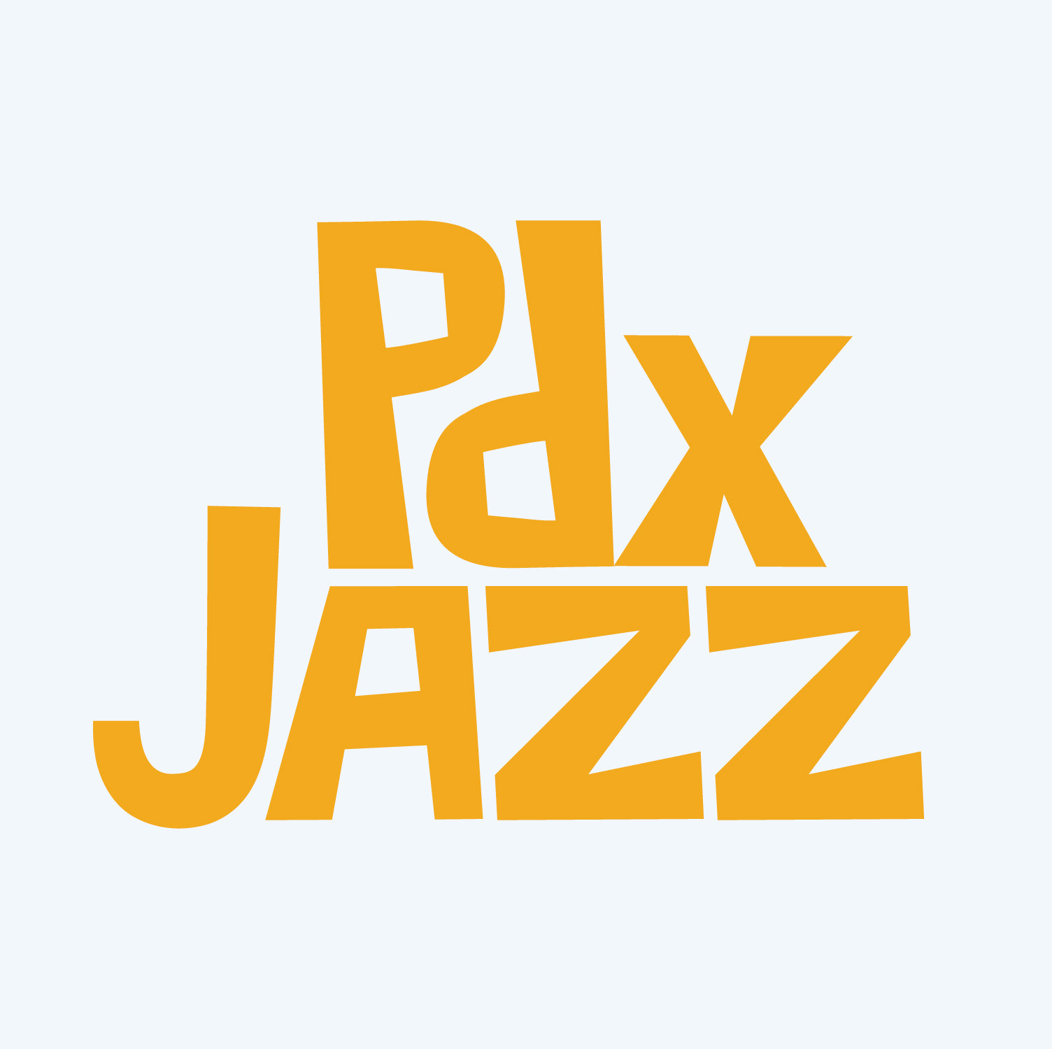
I created a logo that is a visual representation of the improvisational nature of Jazz music, as well as something that will be interesting to younger demographics in the Portland community to continue the legacy and education of Jazz music throughout generations—utilizing a smaller x in PDX to show the collaboration between the city of Portland and Jazz music.
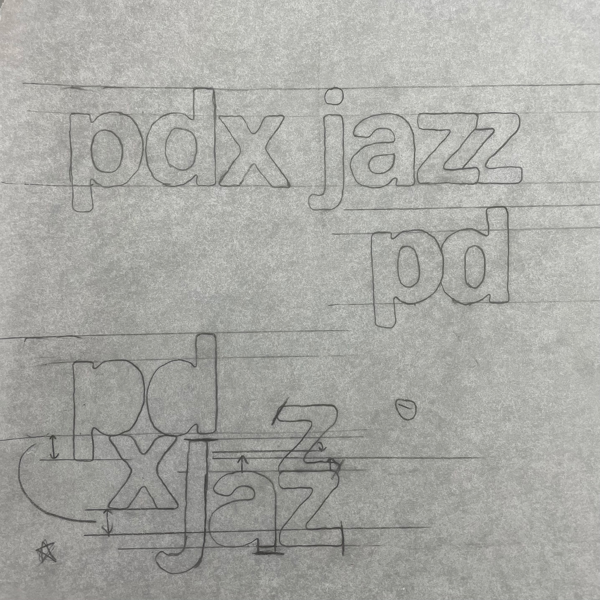
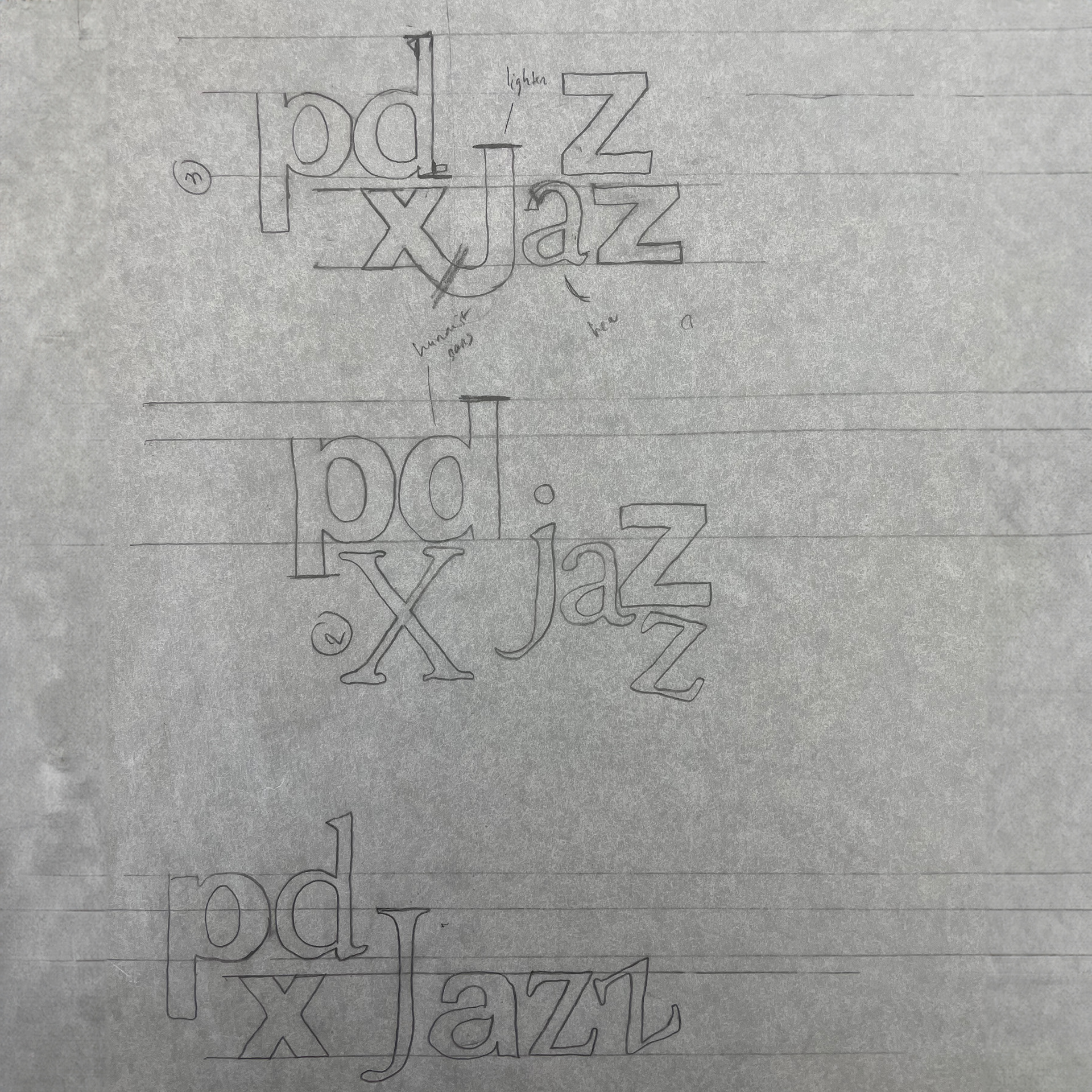
INITIAL SKETCHES
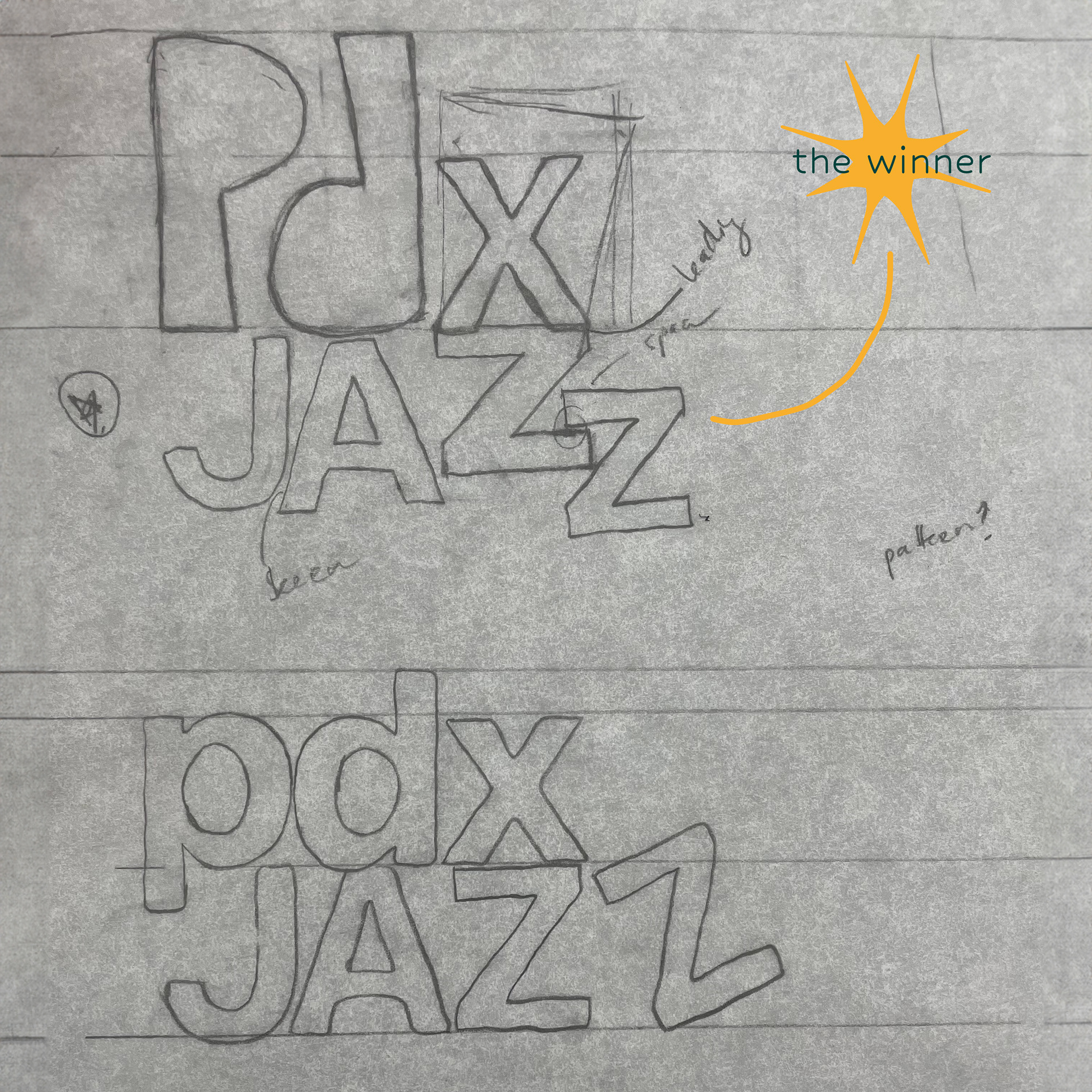
THE RESULT